America’s Cup
The Project
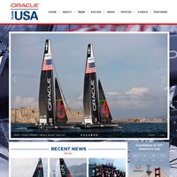
America’s Cup comes home to San Francisco! Every team racing in the 2013 America’s Cup needed a branded team site.
In 2013, the America’s Cup was headed back to the US for the first time in decades, thanks to Oracle Team USA.
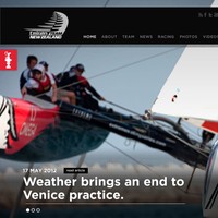
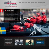
My task was to create a modular template and design system that could be easily and effectively deployed to create a branded site for all the teams joining the America’s Cup competition. The sites were used to keep fans apprised of each team's position in the competition by sharing news, video clips, photos, and interviews.
Using Sparkart Group's in-house headless CMS platform as a base, APIs from YouTube, Wordpress, and Twitter, and custom Handlebars templates, I provided eight racing teams with their own sites for the America’s Cup competition. Each team's homepage used a supplemented version of the general design system. I focused on bringing their branding and personality from this supplement by taking full advantage of CSS's powerful cascade to style the inner pages of each team site quickly and effectively.
Responsibilities
- Building semantic HTML, responsive CSS, presentational JS
- Collaborating with visual designers on module capabilities and functionality
- Building design system that adapts to eight different branding guides
- Responsive browser and device testing
- Site maintenance and updates
Visuals


Co-credits
- Design: Sparkart Group