Vestwell
The Story
A digital retirement platform for financial advisors, employers, and employees, that makes it easier to understand and save for retirement.
Vestwell is redefining what it means to invest in your retirement. With that goal, they needed a site that educated users on what their platform offers, whether that user is a broker who provides investment advice to her clients, an employer that provides retirement services to their employees, or an employee interested in his own retirement plan.
With a recent rebranding in mid-2018, I was tasked with rebuilding and reorganizing their informational site. I took full advantage of Vestwell's new illustrative branding style to use SVGs for crisp, clean icons regardless of screen pixel density and file size, and since no content needed to be managed, I built their new site using a static site generator to increase development speed.
Despite being a relatively concise site, I built a basic design system to speed up page deployment, and used a slightly modified BEM naming-methodology to keep the markup legible for myself and for any other developers who might join the project.
Responsibilities
- Semantic HTML, responsive CSS, presentational JS
- Bring rebrand into site styling
- Accessibility auditing and implementation
- SEO auditing and implementation
- Google Search Panel integration
- Site maintenance and updates
- Responsive email template campaign
- Marketing campaign technical support
Visuals


Code Example: Highlight Module
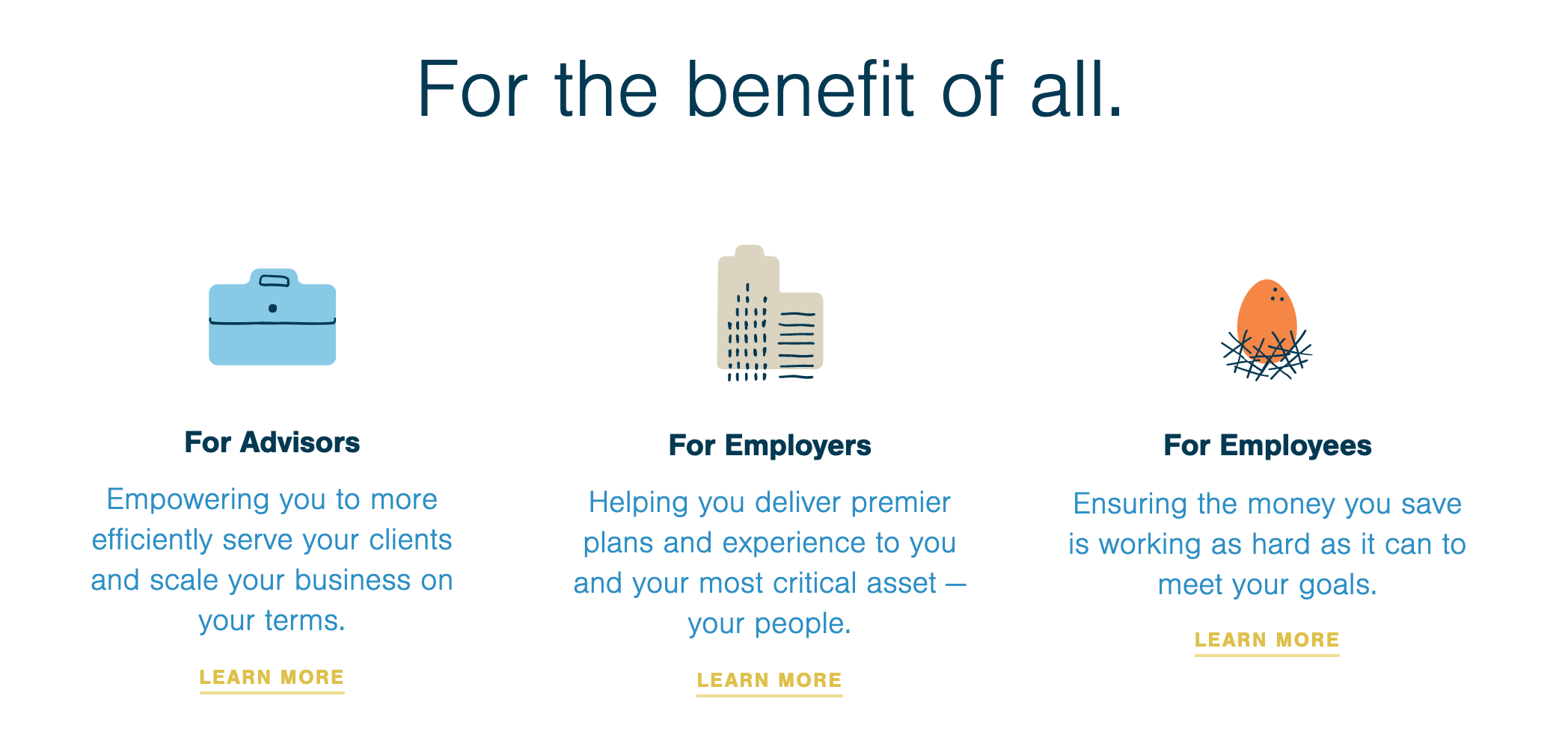
Browser Rendering

HTML
<div class="highlights">
  <h3 class="highlights__heading">
    For the benefit <span class="nowrap">of all.</span>
  </h3>

  <div class="highlights__layout">
    <div class="highlights__highlight">
      <img
        class="highlights__img briefcase"
        src="images/icon-briefcase.svg"
        alt="Illustration of a brown briefcase."
      />

      <h4 class="highlights__type"><span class="nowrap">For Advisors</span></h4>
      <p class="highlights__description">
        Empowering you to more efficiently serve your clients and scale your
        business on <span class="nowrap">your terms.</span>
      </p>
      <p class="highlights__link">
        <span class="nowrap"><a href="/advisors">Learn More</a></span>
      </p>
    </div>

    <div class="highlights__highlight">
      <img
        class="highlights__img building"
        src="images/icon-building.svg"
        alt="Illustration of a tall, blue skyscraper."
      />

      <h4 class="highlights__type">
        <span class="nowrap">For Employers</span>
      </h4>
      <p class="highlights__description">
        Helping you deliver premier plans and experience to you and your most
        critical asset — <span class="nowrap">your people.</span>
      </p>
      <p class="highlights__link">
        <span class="nowrap"><a href="/employers">Learn More</a></span>
      </p>
    </div>

    <div class="highlights__highlight">
      <img
        class="highlights__img nest-egg"
        src="images/icon-nestegg.svg"
        alt="Illustration of a large egg in a straw nest."
      />

      <h4 class="highlights__type">
        <span class="nowrap">For Employees</span>
      </h4>
      <p class="highlights__description">
        Ensuring the money you save is working as hard as it can to meet
        <span class="nowrap">your goals.</span>
      </p>
      <p class="highlights__link">
        <span class="nowrap"><a href="/employees">Learn More</a></span>
      </p>
    </div>
  </div>
</div>
SCSS
.highlights {
  @include clearfix;

  text-align: center;
  margin: 8vw 0;

  @include grid-column(10);
  @include grid-push(1);

  @media #{$media-sm-max} {
    text-align: left;
  }

  &__heading {
    margin-bottom: $base-spacing * 2.5;

    @media #{$media-sm-max} {
      margin-bottom: $base-spacing * 1.5;
    }
  }

  &__layout {
    display: flex;
    justify-content: space-around;

    @media #{$media-sm-max} {
      flex-flow: column;
    }
  }

  &__highlight {
    flex: 0 1 28%;

    @media #{$media-sm-max} {
      position: relative;

      margin-bottom: $base-spacing * 1.5;
      padding-left: 120px;

      &:last-child {
        margin-bottom: 0;
      }
    }
  }

  &__img {
    display: block;
    margin: 0 auto;

    @media #{$media-sm-max} {
      position: absolute;
      left: 0;
      top: 20px;
    }

    &.advisor {
      padding-top: 16px;
      padding-bottom: 9px;
      width: 85px;

      @media #{$media-sm-max} {
        padding-top: 34px;
        padding-bottom: 0;
        margin-left: 11px;
      }
    }

    &.sponsor {
      width: 72px;

      @media #{$media-sm-max} {
        padding-top: 16px;
        padding-bottom: 0;
        margin-left: 18px;
      }
    }

    &.individual {
      padding-top: 23px;
      width: 63px;

      @media #{$media-sm-max} {
        padding-top: 34px;
        padding-bottom: 0;
        margin-left: 21px;
      }
    }
  }

  &__type {
    margin-top: $base-spacing;
    font-weight: 700;
    margin-bottom: $small-spacing;
  }

  &__description {
    color: color(denim);
    margin-bottom: 0;
  }

  &__link a {
    display: inline-block;
    margin-top: $small-spacing;

    letter-spacing: 0.05rem;
    font-size: 0.66rem;
    font-weight: 700;
    text-transform: uppercase;

    transition: all $base-duration $base-timing;
  }
}
Co-credits
- Design: Williamson Adams