Oakland Internet Cat Video Festival
The Project
A fundraiser event so nice they held it twice! OICVF was created to bring the Internet Cat Video Festival to Oakland, California for the benefit of the East Bay SPCA.
Approached by the Great Wall of Oakland’s designer, I took on the task of creating the official event site for the Oakland Internet Cat Video Festival. The one-day event took place in Uptown Oakland and featured cat-themed food, events acts, and adoptions on behalf of the East Bay SPCA.
The major conceptual breakthrough for this site was understanding that the audience of the site shifted as time passed, meaning the site would need to shift with them as the audience’s intent changed. I built the site using a design system and component library that allowed me to rearrange content and components at the drop of a hat.
Mayor Jean Quan declared it “Internet Cat Video Day”!
Responsibilities
- Semantic HTML, Responsive CSS, Presentational JS
- Information architecture
- Branded 3rd party sites (Facebook, Eventbrite, Twitter)
- Adapted site to users’ intent via shifting content modules as event timeline progressed
- Supported event organizers with planning and data collection tools
- Site maintenance and updates
Visuals


Co-credits
- Site design: Niraj Patil
- Logo design: Savio Alphonso
Press
- “A Tale of Two Competing Cat Video Festivals” [KQED]
- “Oakland Internet Cat Video Festival Showcases The Web’s Finest Felines” [HuffPo]
- “Internet Cat Videos Go Public” [EBX]
On Shifting Audiences
Focus the First: Secure Vendors
With no vendors, there would be no event. My first focus was to facilitate vendors submitting information to the event coordinators via form submissions. This also meant we needed to explain the concept of the event, what we were looking for, and what vendors needed to have in order to participate.
I pushed forward the informational content of the site and surfaced the call for vendor submissions on the homepage.
Focus the Second: Sell Tickets
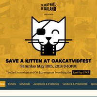
Vendors were secured and while their content and calls for submissions were moved further into the site for secondary focus. The overall focus was now getting people to buy tickets to the event. This meant that I was now working in tandem with the marketing team to inform the public about what exactly this event was, why we were having it, and how they could join us.
I moved forward the ability to purchase tickets and kept the site updated with changes to the entertainment schedule, vendor placements, and event map.
Focus the Third: Navigate the Day
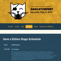
On the day of the event, I shifted the content of the site around to feature the day’s event schedule and map to the homepage. Tickets were still being sold online and at the gate, but I was now focused on supporting the people who were at the event. They needed to know what was happening and where it was happening.
The homepage became a de-facto event program on people’s phones and tablets. While we did have printed programs, quite a few people for both years’ events used the site as their way to navigate the physical event area. The site was responsive, even in 2012 and the emergence of responsive web development.